USL WordPress
Table of Contents
IN THIS SITE GUIDE
USL Guidelines
IN YOUR VIDEO LIBRARY
Basic WP Knowledge
If you’re new to CMS platforms or WordPress, this a great spot to build a foundation. You’ll see it’s not specific to your site, but you’ll get a good overview of concepts and terms.
Let’s take a look at the
WordPress Basics
- Learn about the different blocks available in WordPress
- Learn how to use blocks
Let’s take a look
What’s New
There is no front end login option in WordPress. Admins will need to login by using the /admin URL. Once an admin is logged in, they will remain logged in even if accessing the main URL, or front end of the site.
Blocks and grids are the tools that are used to build pages in WordPress. Think of blocks similar to page elements in SportsEngine and grids similar to layout containers that are used to contain and organize content. Grids are a type of block instead of a separate element type, there are also columns within grids if you need to break up grids even further.
Page status and visibility will function similarly in WordPress to SportsEngine with options for Public, Private, and Password Protected pages. However, WordPress will allow the ability to set pages, not just news articles, to publish at certain dates and times. You can also work on a public page as a draft and preview any changes before the updates are pushed live.
Within pages, you can undo changes with the “undo” backwards arrow, and recover any deleted pages in the trash section of the pages list. There you will also find a list of any pages you created and a separate list for pages that are currently drafts.
To add a page or change the order of your menu/navigation areas, you will go to Appearance>Menus in the dashboard, or through the menus section in the customizer. Once there, you can select your header or footer menu and drag and drop current menu items or add new pages to your menus.
This is also where you can add links to third party pages, like your shop page for example . These are not a separate page type like in SportsEngine, instead you can add them directly to the menu by selecting “custom links” under “Add menu items” and adding them once the URL and link text is filled in.
URL Slugs allow you to set the URL of a page on your site, similar to the Friendly URL feature in SportsEngine. Slugs can also be added to news articles in WordPress, which was not an option in SportsEngine.
News articles can be created through the “News” dashboard section or the “New” tab in the top WordPress menu. Unlike SportsEngine, tags will not need to exist as pages in WordPress. When adding a new news article you will see the “news tags” section within the article settings that will allow you to tag the article and also add new tags to the site. To get an article showing up in an aggregator, the concept will be the same as SportsEngine, where as long as the aggregator and the article have matching tags the article will display.
Functioning similarly to news tags, event categories will control what events will show in an event aggregator.
In WordPress, you can make bulk actions to your content for each tab in your dashboard. For example, you can move multiple pages to the trash or edit them en masse.
In the WordPress dashboard, you can see the recent edits and additions to your site. You can also check which user made the changes. You can also see when someone is currently editing a page or post and will have the option to “take over” editing from that person so multiple edits are happening at the same time.
WordPress uses separate blocks for embeds and code blocks.
Embeds will be used for things like social feeds and Youtube. For a full list of available embeds, please check the embeds help article linked above.
Code blocks will cover all HTML being added to the site. Please note that Javascript code should not be placed inline in WordPress in an HTML block, it should typically be placed in the footer code of the individual page.
With an image attached to a news article or page in WordPress, you can move the focal point cursor on the image to dictate which part of the image shows or is focused on.
In WordPress, you have an entire library of all photos, videos, audios, etc that is or was being used on your site. You can apply actions to these from the library, as well as search them by the file name.
Building + Managing
Sponsors
Sponsors are a taxonomy which is shared among the following post types: Posts, Roster, News, Video, Events, & Pages. Adding a Sponsor within one of the post types, will make it available to all of the post types. Editing an existing Sponsor will update it for all post types.
For the purpose of this documentation, the Sponsor instructions will use Posts as the example post type. However, the steps are the same for all of the post types.
To add a Sponsor, from the left-hand navigation bar, go to Posts -> Sponsors. There are multiple fields when adding a Sponsor, many of which are optional to complete. The important ones to fill out are Name, Sponsor Link, & Sponsor Images. When adding the Name, it should be how the name would appear on your site.
For example, in the case of the Helbiz Sponsor, the Name would be Helbiz. Details for adding the Sponsor Link and Sponsor Images are below. When the fields have been filled out, click the Add New Sponsor Button.
Once a Sponsor has been added, it will be added to the list of Sponsors. Clicking on the title of a Sponsor will load the edit page for that Sponsor, where any details for the Sponsor, such as the Name, Sponsor Link, or Sponsor Images, can be edited.
The Sponsor Link is the field where the Sponsor URL can be added. This would be the complete URL for the Sponsor website, including https://. For example, in the case of the Helbiz Sponsor, the Sponsor Link would be https://helbiz.com.
The Sponsor Images are a pair of upload fields where the Sponsor logos can be added. There is both an option for a Light Image and a Dark Image. Light and Dark options are provided so that a logo will be visible whether it is against a dark or light background color. A white or light-colored image should be uploaded to the Light Image option, and a black or dark-colored image should be uploaded to the Dark Image option. Use the associated Attach a File button to upload each image.
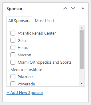
All of the following post types can have a Sponsor logo added to it: Posts, Roster, News, Video, Events, & Pages Simply navigate to the post type or page and find the Sponsor sidebar. Select which Sponsor to include (up to 2 only). If the Sponsor is missing from this sidebar list, you need to follow the steps above first.
Building + Managing
Events
Events posts will be displayed on the frontend on the Events page. Events posts can be accessed on the backend by clicking on Events in the left-hand sidebar. To add a new Events post, click the Add New button.
When adding an Events post, give it a Title. The Events post does not use the block editor, so below the title, an event description can be added by using the classic editor.
Additionally, when creating an Events post, there are multiple settings to be filled out, many of which are optional. However, it is important to complete the Time & Date details. Depending on the type of event, Location, Organizers, Event Website, & Event Cost are other details which may be pertinent to complete.
The sidebar also includes some configuration options when adding a new Events post. Tags offers a way to organize the Event. Sponsor includes a way to select a Sponsor to display with the Event. Event Categories offers an additional way to organize the Event. Event Options has a few further controls, including checkboxes for: Hide From Event Listings (which will hide the Event from the frontend event archive), Sticky in Month View (which will “stick” the Event to the top of its day), & Feature Event (which will highlight the Event). Finally, the Featured Image setting allows for the option to display an image with the Event and on the main Event archive.
For more information on using the Events post type, please refer to the following guide: Getting Started with The Events Calendar.
In addition to the Events post type, there is also a custom events block, SE – Events Aggregator Block. This block will add a feed of selected events into a single post and can be added to any post type which uses the block editor. Once added, there are several options found within the sidebar to customize, including Site Connection, Curation, & Category. More details on these steps can be found below.
Site Connection
The Site Connection option is within the Connection heading and includes a drop-down menu for choosing a different site from which to add news. Any connected site from within the network can be selected.
Curation
The Curation Types setting is within the Select Curation heading and includes 4 options to choose from – Five Day View, Upcoming Event List, Previous Event List, & Filtered List. Selecting one of these would define the type of curation to use. Once a Curation Type is selected, the block will update automatically to display the selection, and any relevant Curation Type options will also be presented. For example, for Five Day View, the block would update to display the next 5 days and any included events. For Upcoming Event List, the block would update to display upcoming events and a slider would be displayed to choose the Number of Events. For Previous Event List, the block would update to display previous events and a slider would be displayed to choose the Number of Events. Finally, for Filtered List, the block would update to display events based on the filter options, and additional controls would be displayed to filter by Start Date and End Date.
Category
The Category setting is within the Select Category heading and includes a drop-down menu to filter the events displayed based on the category which is selected.
Building + Managing
News
News posts will be displayed on the frontend on the News page. News posts can be accessed on the backend by clicking on News in the left-hand sidebar. To add a new News post, click the Add New News Article button.
When adding a News post, give it a Title. Below the title, add to the body of the post by adding blocks. For more information on adding blocks and using the block editor, please refer to the following video tutorial: The Block Editor. The information detailed in that video is universal and can be applied to all post types which use the block editor, such as the News posts.
Additionally, when adding a News post, give it a News Tag, a Sponsor, and a Featured Image. More details on these steps can be found below.
Adding News Tags
To apply a News Tag to a News post, look in the right-hand sidebar for the News Tag section. Click the downwards caret to expand the section. To select a News Tag, check the box next to the appropriate News Tag. If the desired News Tag isn’t displayed, click the “Add New News Tag” link, which will reveal a field to enter a name and a button to add it.
RSS Feeds
With WordPress, if you add “feed” at the end of a URL it will give you the RSS feed for that page.
Ex. for all news on the site: https://(sampleURL).com/news/feed
Ex. for academy news tag: https://(sampleURL).com/newstag/academy-news/feed
Adding Sponsors
To apply a Sponsor to a News post, look in the right-hand sidebar for the Sponsor section. Click the downwards caret to expand the section. To select a Sponsor, check the box next to the appropriate Sponsor. If the desired Sponsor isn’t displayed, click the “Add New Sponsor” link, which will reveal a field to enter a name and a button to add it.
Adding a Featured Image
To add a Featured Image to a News post, look in the right-hand sidebar for the Featured Image section. Click the downwards caret to expand the section. Click the “Set Featured Image” button which will reveal the Media Library popup. For more information on adding a Featured Image, please refer to the following video tutorial: Add a Featured Image. The information detailed in that video is universal and can be applied to all post types which use a Featured Image, such as the News posts.
In addition to the News post type, there is also a custom news block, SE – News Aggregator Block. This block will add a feed of selected posts into a single post and can be added to any post type which uses the block editor. Once added, there are several options found within the sidebar to customize, including Site Connection, Curation, Number of Posts, & Layout. More details on these steps can be found below.
Site Connection
The Site Connection option is within the Connection heading and includes a drop-down menu for choosing a different site from which to add news. Any connected site from within the network can be selected.
Curation
The Curation setting is within the Content heading and includes 3 options to choose from – Automatic, Manual, or News Tag. Selecting one of these would define the type of curation to use. Once a Curation is selected, the Curation Type field will update automatically to display the relevant Curation Type options. For example, for Automatic, this would include Latest or Most Commented. For Manual, a list of posts would be displayed to choose from. For News Tag, a drop-down menu would appear with a list of available News Tags to select.
Number of Posts
The Number of Posts setting is within the Display heading and includes a toggle to adjust the number of posts which will be displayed.
Layout
The Layout setting is within the Display heading and includes a drop-down menu for choosing the type of layout to select for displaying the posts. The available options include List, Card, or Image layouts.
Building + Managing
Rosters
Roster posts will be displayed on the frontend on the Roster page. Roster posts can be accessed on the backend by clicking on Roster in the left-hand sidebar. Individual Roster posters are referred to as Team Member posts. To add a new Team Member post, click the Add New Team Member button.
When adding a Team Member post, give it a Title. The Title should be the name of the Team Member. Below the Title is the block editor, which can be ignored, as it isn’t used for Team Members.
When adding a Team Member post, fill out the Team Member Details section, with the Uniform Number, Sponsor, & Social Media fields. Additionally complete the Roster Years, Position, and Featured Image sections. More details on these steps can be found below.
To add a Uniform Number to a Team Member post, look in the Team Member Details section for the Details heading – the Uniform Number field is nested below. Add the appropriate number to the field.
To add a Sponsor to a Team Member post, look in the Team Member Details section for the Sponsor heading. An Image (Sponsor logo), Text (Sponsor name), & Link (Sponsor website) can all be added here. Use the “Attach a File” button to add the Image. Enter the Sponsor name in the Text field. Enter the Sponsor website URL to the Link field, being sure to include https:// as part of the link.
To add a Sponsor to the Roster page itself, go to the Customizer and select Archive Controls>Roster. There you can turn the sponsor title off or add a new Sponsor to the page.
To add Social Media links to a Team Member post, look in the Team Member Details section for the Social Media heading. For each network which will be included, enter the URL to the team member’s profile link, being sure to include https:// as part of the link.
To apply Roster Years to a Team Member post, look in the right-hand sidebar for the Roster Years section. Click the downwards caret to expand the section. To select a Roster Year, check the box next to the appropriate year. If the desired year isn’t displayed, click the “Add New Roster Year” link, which will reveal a field to enter a name (year) and a button to add it.
To apply a Position to a Team Member post, look in the right-hand sidebar for the Positions section. Click the downwards caret to expand the section. To select a Position, check the box next to the appropriate position. If the desired position isn’t displayed, click the “Add New Position” link, which will reveal a field to enter a name and a button to add it.
To add a Featured Image to a Team Member post, look in the right-hand sidebar for the Featured Image section. Click the downwards caret to expand the section. Click the “Set Featured Image” button which will reveal the Media Library popup. For more information on adding a Featured Image, please refer to the following video tutorial: Add a Featured Image. The information detailed in that video is universal and can be applied to all post types which use a Featured Image, such as the Team Member posts.
Find the right
Image Size/Aspect Ratios
| Type | Size/Ratio |
|---|---|
| Hero Video | Aspect Ratio: 21:9, Recommended size examples: Determined by video pixel density |
| Hero Slideshow | Aspect Ratio: 21:9, Recommended size examples: 1800 x 772, 1600 x 868, 1400 x 600 |
| News Cards | Aspect Ratio: 16:9, Recommended size examples: 800 x 450, 600 x 338, 400 x 225 |
| CTA | Aspect Ratio: 3:2, Recommended size examples: 450 x 300, 380 x 254 |
| Full Width Billboard | Aspect Ratio: 21:9, Recommended size examples: 1800 x 772, 1600 x 686, 1400 x 600 |
| Video Card CTAs | Aspect Ratio: 16:9, Recommended size examples: 400 x 225 |
| Roster Images | Aspect Ratio: 1:1, Recommended size examples: 275 x 275 |
| Bio Card | Aspect Ratio: 1:1, Recommended size examples: 400 x 400 |
| Countdown Timer | Aspect Ratio: 3:2, Recommended size examples: 450 x 300, 380 x 254 |
| Page Title Image | Aspect Ratio: 3:1, Recommended size examples: 1440 x 480 |
When full width desktop graphic images are converted to mobile viewports, cropping of the image is necessary to accommodate the different viewing environments. By default, each image is set to focus on the center of the original graphic, cropping from the sides inward.
The following display estimates are based on the uploaded graphic being the recommended image ratio for the location as outlined in the site guide.
Hero media slider and Full-width Billboard images – Once converted to mobile viewing these will display about 30% of the original image. The focus of the image for mobile view can be determined using the “Focal Point Picker” tool in the cover block page element.
News article header image – The news article header displays a cropped version of the news article main image at the top of the article (the news article title image), and a full version at the top of the article text.Once converted to mobile viewing the news article title image will display the center of the uploaded graphic – showing about 30-40% of the main news article image.
It is also vital that an article/slide uses actual text headers instead of images with text, for the reasons provided by the Bureau of Internet Accessibility in this article.
Dive in to
Ads
The leaderboard ad is displayed at the top of each page, below the navigation. It is possible to add either a custom image and link, or a Google Ad, into this slot. To add or update the leaderboard ad, go to Appearance -> Customizer, and select the Leaderboard Ad section.
The first option is Display Leaderboard which can be used to turn the ad slot off entirely. Below that, there is an option to add a Google Ad slot, which can output both a 970×90 desktop ad and a 320×50 mobile ad, which will automatically display in the right mobile context. For each Ad type, add the Tag Slot and Div Id. See “Getting Google Ad Tag Slot Div Id” instructions below for details on how to retrieve these values.
If you would rather use a custom image and link, upload an image to the Image field and add a URL to the Link field.You can also select an orange or black background style as well as add an optional sponsor section to the left side of the ad. Once selected, the sponsor section will output the Sponsor Text and a sponsor logo pulled from the Sponsor option.
The right rail ad can be added to any page using the block editor, though the ad itself is set globally and will apply to all of the places the ad is output. To add or update the right rail ad, first go to Appearance -> Customizer, and select the Right Rail Ad section. Add the Tag Slot and Div Id. See “Getting Google Ad Tag Slot Div Id” instructions below for details on how to retrieve these values.Once the ad details have been added they can be output inside of any page using the block editor using the SE – Right Rail Ad block. There are no options for the block, it will output the 300×250 ad to the front-end of the site wherever the block is added.
The Tag Slot and Div Id can be found in the Google Ad script embed. Given the code:
<script async src=”https://securepubads.g.doubleclick.net/tag/js/gpt.js“></script>
<script>
window.googletag = window.googletag || {cmd: []};
googletag.cmd.push(function() {
googletag.defineSlot(‘/282480843/Championship-Ad-Network’, [300, 250], ‘div-gpt-ad-1620334753921-0’).addService(googletag.pubads());
googletag.pubads().enableSingleRequest();
googletag.enableServices();
});
</script>
<!– /282480843/Championship-Ad-Network –>
<div id=’div-gpt-ad-1620334753921-0′ style=’width: 300px; height: 250px;’>
<script>
googletag.cmd.push(function() { googletag.display(‘div-gpt-ad-1620334753921-0’); });
</script>
</div>
The Tag Slot corresponds to the text directly after googletag.defineSlot. In this example, /282480843/Championship-Ad-Network. The Div Id matches the part of the code that begins with div-, on the same line as the tag slot. In this example, div-gpt-ad-1620334753921-0.
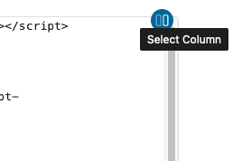
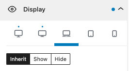
You can add Google Ads into posts using the Custom HTML block. However, you will likely need one ad for the desktop viewport and one for the mobile. To do so, add both in separate custom HTML tags wrapped in either a Column or Group block (this method won’t work directly on the HTML tag).
Select the column or group
In the Block section in the sidebar select the Display category.
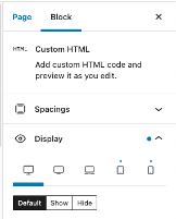
For the desktop block, select the Hide button on the final three screen options (Laptop, Tablet, Mobile).
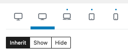
For the mobile block select the Hide button for the first two screen options.
Building + Managing
Videos
Video posts will be displayed on the frontend on the Video page. Video posts can be accessed on the backend by clicking on Video in the left-hand sidebar. To add a new Video post, click the Add New Video button.
When adding a Video post, give it a Title. Below the title, embed a video by pasting a YouTube URL directly into the block editor, such as https://www.youtube.com/watch?v=AnytgioRkNQ. Alternatively, a YouTube embed block can be used to add the YouTube URL. If any other content is to be added beyond the video, additional blocks can be inserted below the YouTube video. For more information on adding blocks and using the block editor, please refer to the following video tutorial: The Block Editor. The information detailed in that video is universal and can be applied to all post types which use the block editor, such as the Video posts.
It is not necessary to include a Featured Image with a Video post, as the embedded video will be displayed in place of an image on the archive page.
Building + Managing
Hero Media Slider
The Hero Media Slider allows for multiple slides to be added to one container. This block is called ‘Carousel’ within WordPress and can be added to any post type as a block. You can either create a new slider using the steps below, or simply edit the current slider on the homepage.
- Add Carousel Block
- Adjust to full width
- Adjust to how many slides you need (1-7)
- Change effect to Fade
- Change to 1 slide per view
- Change autoplay to 7
- Change gap to 0
- You can then add a Billboard block to live inside of the carousel to display each slide as you need.
Building + Managing
Custom Blocks
The SE – Countdown Timer block can be added to any post type, the same as any other block. Once the SE – Countdown Timer block has been added to the post content, it can be configured in the sidebar settings.
The Countdown Settings section has several options for configuring the timer:
- Expiration is the exact time when the countdown timer should reach “zero”. Clicking the link will reveal a date/time selector popup. The month, day, year, hour, & minute should all be selected.
- Timezone is a drop-down menu to set the timezone of the countdown.
- Layout includes display options for Full width layout or Column layout.
- Background Position can be set to Center, Left, Right, Top, or Bottom.
- Any text added to the Text Before field will then be displayed before the numbers in the countdown.
- Site Connection creates the ability to choose a different network site. Doing so, allows for the option to use sponsors which are unique to the selected site.
- Sponsored By can be used to add a selected sponsor to the timer.
Text Color is a color picker tool for setting the color of the Countdown Timer text. The color can be set by using the color sliders, or by entering a hexadecimal color code. Clicking the downward caret can toggle the color code format from hexadecimal to RGB to HSL.
Overlay Color is a color picker tool for setting the background color of the Countdown Timer block. The color can be set by using the color sliders, or by entering a RGBA color code. Clicking the downward caret can toggle the color code format from RGBA to HSLA. Because this is an overlay color option, there is an additional color selector for “a” which is the Alpha channel. This controls the opacity and can be used to make the color partially transparent or fully opaque. This option can be used in combination with the Background Image setting to apply a transparent color over a background image.
Button is a toggle which can be used to add a call to action button to the timer. Clicking the toggle will reveal options for a Button Text field and a Button URL field, which can be used to enter the text of the button and the destination link, respectively. Background Image includes a button to “Choose an image”. Clicking the button will reveal the media library popup, where an image can either be uploaded, or selected from the existing library.
The SE – Event Aggregator block is covered in more detail as part of the Event post type section.
The SE – News Aggregator block is covered in more detail as part of the News post type section.
The SE – OPTA Widget is a widget in name only. This is actually a custom block and is available to use with any post type where other blocks are added. There are two steps for using the SE – OPTA Widget.
SE – OPTA Widget Customizer Settings
In order to use the SE – OPTA Widget, it must first be configured within the Customizer. To do so, go to Appearance -> Customizer, in the left-hand navigation bar. Once in the Customizer, click into the OPTA Widget Settings section. In the next panel, a Subscription ID can be entered.
Adding the SE – OPTA Widget Block
The SE – OPTA Widget can be added to any post type, the same as any other block. Once the SE – OPTA Widget block has been added to the post content, Widget Content can then be added in the sidebar. It is essential that this widget code is added in the SE – Opta Widget block, not a standard code block like in SportsEngine. The full widget code should be entered. It may take a few seconds for the widget to load.
The CTA block can be added to any post type, the same as any other block. Once the CTA block has been added to the post content, it can be configured in the sidebar settings.
When adding a CTA block individually, it will default to full width. If you need to add multiple CTA’s in rows/columns, you’ll first want to add the Columns block. Once choosing the column amount needed, you can Add(+) as many CTA blocks as you need to each column.
Block Settings:
- Upload Image or choose from current images in Media Library
- Assign a URL to CTA via the paperclip icon on block menu
Block sidebar settings:
- Transform to variation
- Image with Arrow
- Button
- Card
- Styles
- Landscape
- Portrait
- Sponsor Settings
- Sponsor Text: ex: Powered by, Presented by
- Select Sponsor
- Toggle on/off ‘Sponsor over dark background’
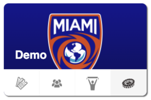
The CTA Card with Icons block can be added to any post type, the same as any other block. This will allow you to link the card to Tickets, Crowds, Supporters, and Stadium.
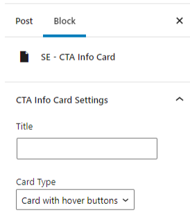
The block is titled in the Editor as ‘SE – CTA Info Card’.
Block Sidebar Settings:
1. Card Type dropdown: In the Block sidebar settings, select ‘Card with hover buttons’ from the dropdown.
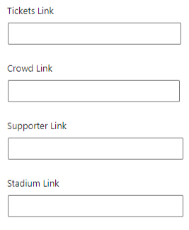
2. Icon Links: Add the necessary links in each option
3. Background Image: Add Club Logo
The CTA Card with Icons block can be added to any post type, the same as any other block. This will allow you to link the card to Tickets, Crowds, Supporters, and Stadium.
The block is titled in the Editor as ‘SE – CTA Info Card’.
Block Sidebar Settings:
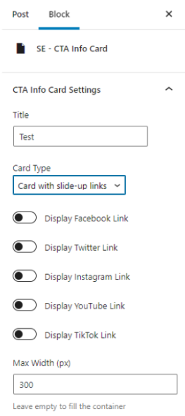
- In the Block sidebar settings, select ‘Card with slide-up links’ from the Card Type dropdown.
- Toggle on the social icons you would like displayed, and input the URL into each link box
- Add Club logo under Background Image
Editor:
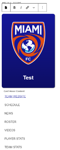
Under ‘Card Hover Content’ you can add the text links you’d like placed on the card. Once adding the text, highlight each one individually and select the link icon to choose what page each link should direct to.
The Link Card block can be added to any post type, the same as any other block. This will allow you to add a CTA Card with a higher character limit.
Before adding the Link Card block, add a Grid block. This will allow you to condense the sizing if needed.
- Select the 1st full width icon
- Click the + sign
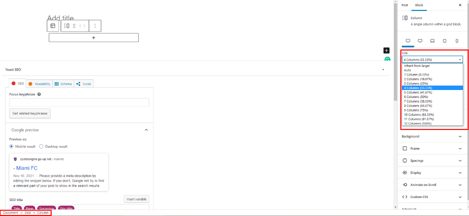
Block Sidebar Settings: Document – Grid – Column
- Select from the drop down the width you’d like the Link Card to be based on the %.
- Ex: 33.3% will be used below
- Click the + that appears in the Column block, and add the Link Card Block
Block Sidebar Settings: Document – Grid
To align the column you created with the Link Card block inside, use the bottom bar and click Grid.
- Select the alignment options as you’d like in these three places. In this example, it centers the column in the middle of the post.
- Upload the info needed to the Link Card.
- Upload Image or select Media Library
- Enter Card Description Here: (insert max character limit suggested)
- Enter Button Text Here:
- Add Button label
- Add URL with icon on menu bar
Bio Card Block Settings:
- Select Landscape or Portrait Style
The Billboard block can be added to any post type, the same as any other block. The Billboard block allows for the following types: All of these options allow for a background image, or a color gradient.
- Fullwidth with Sponsor & Buttons – Step by step below
- Fullwidth Content Centered – steps below with option to change text alignment

3. 50/50 – Follow all steps below after adding Column block
- To add a background: (1920 x 1080px preferred for image)
- Add cover block – set to full width
- Upload an Image, select image from Media Library, or select a solid color.
- For custom color, see block sidebar settings under Overlay
- Add Media > Open Media Library > Select image
- Media Settings Sidebar:
- Toggle on ‘Repeated background’
- Select focal point on right sidebar if needed
- Add Overlay color to image if needed
- Adjust padding if needed based on device
- Add animation to text (Fade(preferred)/Zoom)
- Media Settings Sidebar:
- Upload an Image, select image from Media Library, or select a solid color.
- Add cover block – set to full width
- Add Billboard Block below Cover Block
- Under Styles sidebar select – Content on Light Background or Dark dependent on background color/image
- Update Tag, Title, Text and Buttons
- Under Sponsor Settings sidebar, assign title and Sponsor logo
- Block sidebar settings
- Styles: choose content on dark or light background
- Sponsor settings: add powered by text and logo
- Add ‘Buttons’ block
- Update transform settings on the sidebar
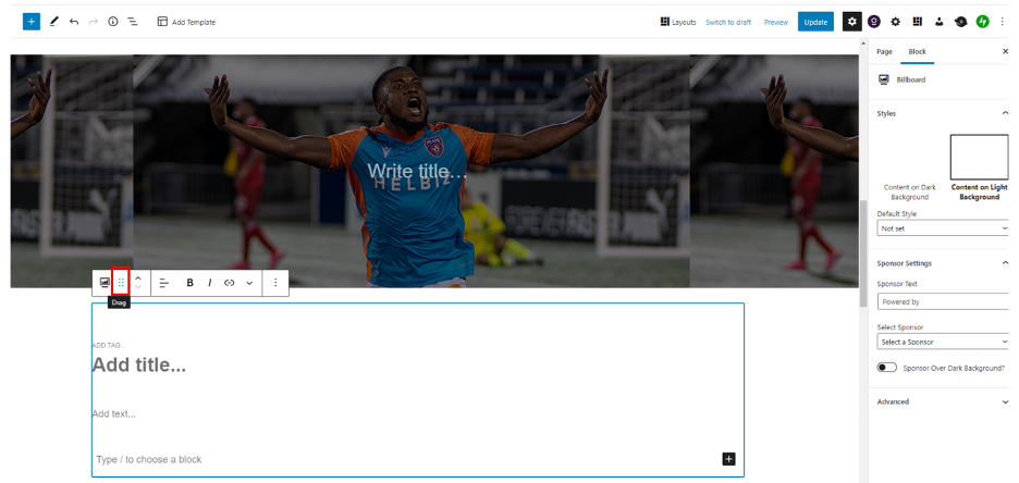
- At this time you will have two blocks: Billboard and Cover. You can now drag the Billboard block over the Cover to ‘group’ them using the Drag icon below.
The Bio Card block can be added to any post type, the same as any other block. This will allow you to add Staff Members, or people needing descriptions.
Before adding the Bio Card block, add a Grid block.
- Select the 1st full width icon
- Click the + sign
Block Sidebar Settings: Document – Grid – Column
- Select from the drop down the width you’d like the Bio Card to be based on the %.
- Ex: 33.3% will be used below
Click the + that appears in the Column block, and add the Bio Card Block
Block Sidebar Settings: Document – Grid
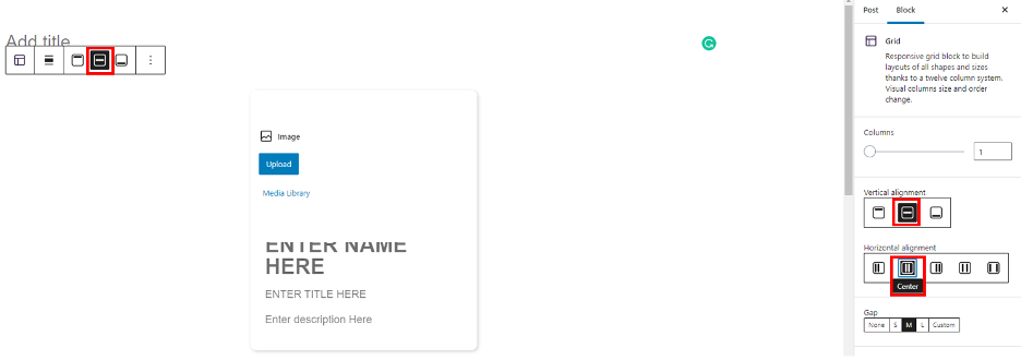
To align the column you created with the Bio Card block inside, use the bottom bar and click Grid.
- Select the alignment options as you’d like in these three places. In this example, it centers the column in the middle of the post.
- Upload the info needed to the Bio Card.
- Upload Image or select Media Library
- Enter Name Here: (First, Last)
- Enter Title Here: Job Title
- Enter Description here: This area does not have a character limit. As the area limit is reached for the size selected, a scroll bar will be added to allow users to read through the entire bio.
Bio Card Block Settings:
- Select Landscape or Portrait Style
The Social Card block can be added to any post type, the same as any other block.
Once published, the final styles will be pulled in to look like the final image below.

Block Settings:
Enter Title: Follow Us
Click on each icon, to add URL to social pages. Click to remove any icons not needed.
*Must have icons square in order to pull correct styling*

The Email Subscription block can be added to any post type, the same as any other block. This is saved as a Reusable Block so you can update that in order to update all places where this block has been called across the site.
Note: If you update the Reusable Block, it will update every place it’s added to the site.
Go to the post type you’d like to see this banner live – Add Block > Email Subscription Window
- Update Title
- Insert HTML code from the email provider that the club is using.
- Enter subtitle “By clicking subscribe, you are agreeing to the USL privacy policy and agree to receive emails from USL.
To change background image or color, select Cover block and update the Settings in the block Sidebar.
Building + Managing
Sidebars
Sidebars are populated with Widgets. There are multiple widget areas, some of them unique to specific page templates or post types. Widgets can be accessed either by going to Appearance -> Widgets or by going to Appearance -> Customize and then selecting Widgets. For more information on accessing widgets and adding widgets, please refer to Video Tutorials > #16 How to Add Widgets in your site’s dashboard.
There are multiple widget area available:
- Header Right – This widget area is located within the header of the site, appearing to the right of the main menu bar.
- Primary Sidebar –
- Before Header – This widget area is located within the header of the site, appearing in the USL Network bar, located above the main logo and primary menu.
- After Header – This widget area is located within the header of the site, appearing just below the main logo and primary menu.
- Page 1 – This widget area is displayed below the main content of all pages, posts, & post types, as well as the homepage.
- Page 2 – This widget area is displayed below the main content of all pages, posts, & post types, as well as the homepage.
- Page 3 – This widget area is displayed below the main content of all pages, posts, & post types, as well as the homepage.
- Page 4 – This widget area is displayed below the main content of all pages, posts, & post types, as well as the homepage.
- Page 5 – This widget area is displayed below the main content of all pages, posts, & post types, as well as the homepage.
- Page 6 – This widget area is displayed below the main content of all pages, posts, & post types, as well as the homepage.
- Page 7 – This widget area is displayed below the main content of all pages, posts, & post types, as well as the homepage.
- Footer Right – This widget area is located within the footer of the site, appearing to the right of the footer navigation.
After Entry –
The Sponsor Widget is a way to display a Sponsor from within a widget area. When adding a Sponsor Widget, the following options are available:
- Title – Text entered here will be displayed above the sponsor logo
- Light or Dark Logo – Choose between the Sponsor’s light-colored or dark-colored logo
- View – Choose between Static or Slider
- Select Sponsors you want to show – check the box(es) next to the Sponsors which are to be displayed
Building + Managing
Network
A super-admin has the ability to set connections between sites. In order to access the connection tab, navigate to the network admin > All Sites. Find the site that needs to be updated and select Edit. This will bring up the site’s network settings. A connection tab will appear in the list of tabs.
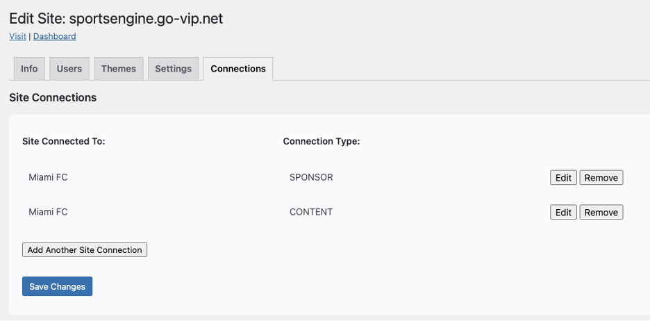
Connected To
List of available sites to create a connection with. The site with the connection tab allows the sites “connected to” to share its content with. In the screenshot above, the site sportsengine.go-vip.net’s content and sponsor templates will appear on the Miami FC site.
Connection Type
Sponsor – Shares the sponsor templates
Content – Shares news and events
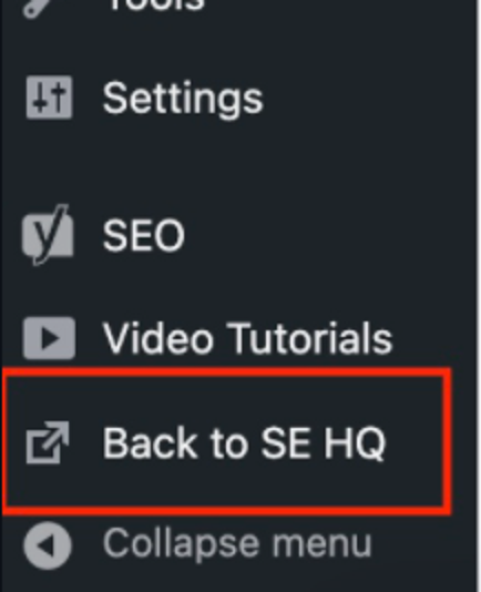
A super-admin has the ability to set a link back to SportsEngine HQ. In order to access the options tab, navigate to the network admin > All Sites. Find the site that needs to be updated and select Edit. This will bring up the site’s network settings. A options tab will appear in the list of tabs.
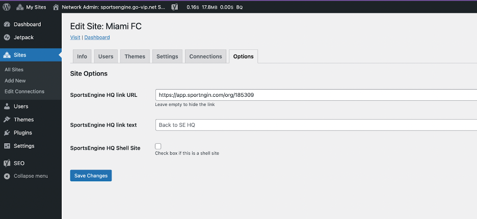
- The URL will link back to that site’s HQ URL.
- The link text will be the visible text that each site will see.
- The Shell Site toggle should remain unchecked if the news articles are being pulled directly from the site’s database (the News tab on the left-hand side of the admin view). It should be checked if the site is a “shell site”, which pulls in News articles from an external source via API.
View from the individual site’s admin.
Building + Managing
Templates
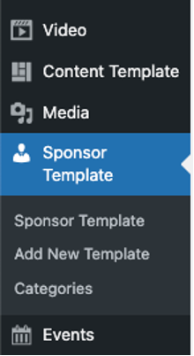
Access by appending `wp-admin/edit.php?post_type=sec_sponsor_template` to the end of the site url.
Sponsor Templates are reusable templates that can be utilized to speed up the process of adding sponsors to content in a consistent manner when creating a new post.
Creating a new Sponsor Template
To create a new Sponsor Template, go to Sponsor Template and click the Add New Template button.
On the next screen, you will be presented with the block editor interface. Give your Sponsor Template a title, so that you will be able to identify the particular template from a list later. Next, add content that you wish to reuse when creating new posts. For example, you may wish to include paragraphs, headings, images, or a gallery. You may also wish to configure more complex layouts at this stage, such as columns or groups, so that it will be easier to incorporate those types of layouts when selecting the template for use later. When you’re finished configuring your template, click the Publish button.
Editing an existing Sponsor Template
After a Sponsor Template has been created, it can later be selected for editing. To edit, go to Sponsor Template and click on the title of the template you wish to edit. On the next screen, make adjustments to your layout as needed. For example, you may wish to reorder your content, add a quote to a layout, or add some additional images. When finished making your edits, click the Update button. Any changes made to an existing Sponsor Template will only be applied to future uses of the template. Any instances of the template having been added to a post will not be affected.
Using a published Sponsor Template
To use a Sponsor Template, you would go to a Post (or a page). You can use an existing post or add a new post. To access the available Sponsor Templates, look towards the top-right corner of the site for the person icon. Click this to reveal the RKV Sponsor Templates sidebar, which will include any published Sponsor Templates.
To load a template to your post, click the plus icon next to the Sponsor Template you wish to use. You will see a popup note that states: “Apply this template? This will append the selected template to the content in the editor.” Click the Apply button to proceed.
Once the Sponsor Template has been added to your post, you can edit the content as needed. Editing the content once it’s been added to a post will only edit this specific content. The template itself will stay preserved to be reused again. You are free to add any additional content or remove any of the template content, as needed. Be sure to Save or Publish your work when finished.
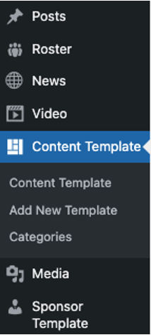
Access by appending `wp-admin/edit.php?post_type=sec_content_template` to the end of the site url.
Content Templates are reusable templates that can be utilized to speed up the process of adding content in a consistent manner when creating a new post. These can be added to any Parent or Child site for use.
Creating a new Content Template
To create a new Content Template, go to Content Template and click the Add New Template button.
On the next screen, you will be presented with the block editor interface. Give your Content Template a title, so that you will be able to identify the particular template from a list later. Next, add content that you wish to reuse when creating new posts. For example, you may wish to include paragraphs, headings, images, or a gallery. You may also wish to configure more complex layouts at this stage, such as columns or groups, so that it will be easier to incorporate those types of layouts when selecting the template for use later. When you’re finished configuring your template, click the Publish button.
Editing an existing Content Template
After a Content Template has been created, it can later be selected for editing. To edit, go to Content Template and click on the title of the template you wish to edit. On the next screen, make adjustments to your layout as needed. For example, you may wish to reorder your content, add a quote to a layout, or add some additional images. When finished making your edits, click the Update button. Any changes made to an existing Content Template will only be applied to future uses of the template. Any instances of the template having been added to a post will not be affected.
Using a published Content Template
To use a Content Template, you would go to a Post (or a page). You can use an existing post or add a new post. To access the available Content Templates, look towards the top-right corner of the site for the square mosaic grid icon. Click this to reveal any published Content Templates.
To load a template to your post, click the plus icon next to the Content Template you wish to use. You will see a popup note that states: “Apply this template? This will append the selected template to the content in the editor.” Click the Apply button to proceed. Once the Content Template has been added to your post, you can edit the content as needed. Editing the content once it’s been added to a post will only edit this specific content. The template itself will stay preserved to be reused again. You are free to add any additional content or remove any of the template content, as needed. Be sure to Save or Publish your work when finished.
League-Level
Functionality
The plugin creates two new menu display locations: `Network Menu (all sites)` and `Network Menu Mobile Header (all sites)`.
Setup:
1. Create the `Network` menu and associate it with the `Network Menu (all sites)` location.
*This only needs to happen once. But it is good to show in setup if a new environment is ever spun up.* 2. This should have two levels, the parents will display as the menu top row links and the children as tab links.
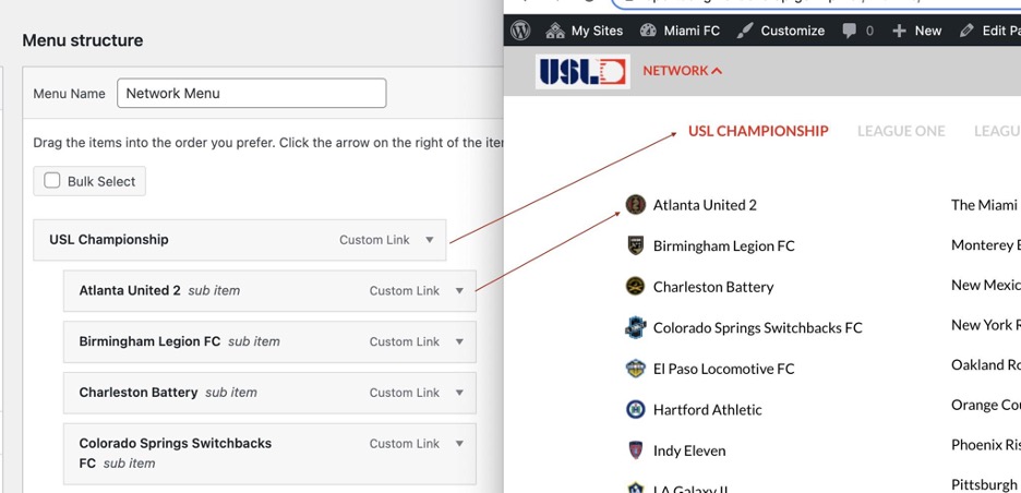
3. To create a tab that contains a slider, add the `rkvnm-tab-slider` css class to the parent menu item.
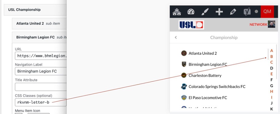
4. To create a letter target (used for quick letter navigation on mobile) add the `rkvnm-letter-{LETTER}` (for example `rkvnm-letter-a`) on the first child item in that letter group.
5. For the EXPANSION TEAMS SEPARATOR create a menu item with the class `expansion-teams`
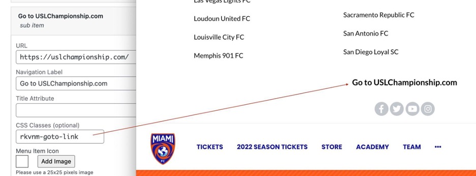
6. For the link displayed at the bottom of the tab, create a menu item with the class `rkvnm-goto-link`
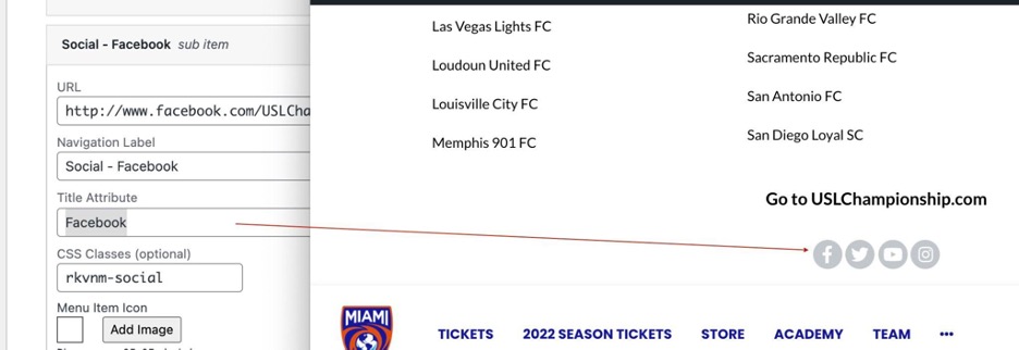
7. For the social link icons at the bottom of the tab, create menu items with the class `rkvnm-social` and the Title Attribute representing the name of the social network (this is used to identify the icon)
8. On tabs with sliders, to mark the menu item that should go the next slide, set the class `rkvnm-start-slide`
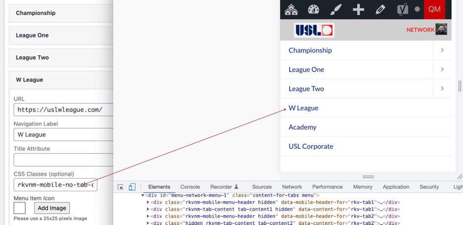
9. Populate the mobile menu only with the header links that appear in the first mobile screen. Items that do not have an expanding right panel should have the class `rkvnm-mobile-no-tab-content`
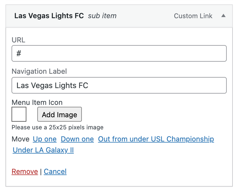
10. Adding a team/club link is a Custom Link from the WordPress Menu. Add the team or club link in the URL field. The Navigation Label will display the text of the link. The Menu Item Icon is added through the media library by selecting the Add Image button.
11. If the `Network Menu (all sites)` location is not populated then the hard-coded menu is displayed (for comparisons / testing).
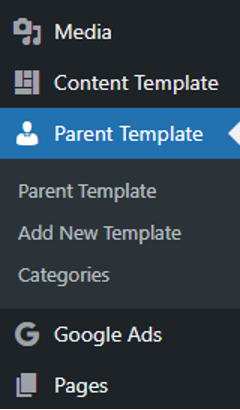
Access by appending `wp-admin/edit.php?post_type=sec_sponsor_template` to the end of the site url.
Parent templates can only be accessed on the following sites:
Parent:
(USL Soccer – https://vip.sportsengine.com/usl/)
League Affiliate:
(Championship – https://vip.sportsengine.com/uslchampionship )
(League One – https://vip.sportsengine.com/uslleagueone)
(League Two – https://vip.sportsengine.com/uslleaguetwo/)
(W League – https://vip.sportsengine.com/wleague)
Any Parent or League Affiliate site that has been connected to a Child Club site during onboarding can have these templates applied. The Child Clubs will NOT be able to unlock these Parent Templates once applied. Only the source Parent site can edit the templates which will automatically update where added.
These templates can be applied to Pages, Posts, News, Video or Roster. You can select multiple of these if needed on all URL’s across the site.
Creating a new Parent Template
To create a new Parent Template, go to Parent Template and click the Add New Template button.
On the next screen, you will be presented with the block editor interface. Give your Parent Template a title, so that you will be able to identify the particular template from a list later. Next, add content that you wish to reuse when creating new posts. For example, you may wish to include paragraphs, headings, images, or a gallery. You may also wish to configure more complex layouts at this stage, such as columns or groups, so that it will be easier to incorporate those types of layouts when selecting the template for use later.
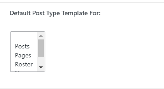
You can then select what Post Types this template should apply to on all connected Child sites. This section is located under the YOAST SEO dropdown.
When you’re finished configuring your template, click the Publish button.
Editing an existing Parent Template
After a Parent Template has been created, it can later be selected for editing. To edit, go to Parent Template on the source site in which it was created and click on the title of the template you wish to edit. On the next screen, make adjustments to your layout as needed. For example, you may wish to reorder your content, add a quote to a layout, or add some additional images. When finished making your edits, click the Update button. Any changes made to an existing Parent Template will apply to all locked templates on every Child site.
How a child site can apply Parent Templates
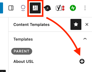
When creating a page, post, news, etc., the child can apply a parent template by selecting the Content Template icon in the upper right and clicking the “+” icon next to the template that will be used.


